How to design your checkout: templates and slots
Pick a research-backed checkout template, fill its slots (headline, bullets, testimonials, guarantee, FAQ) and let AI draft the copy from your course.

 By Knola5 min read
The page that takes the money is the one a free-form editor lets you ruin, so Knola’s checkouts are curated: you pick a proven design and fill structured blanks, and the payment layout stays protected. Every design keeps the same trusted payment form. You choose the angle and write the words.
Open the design studio
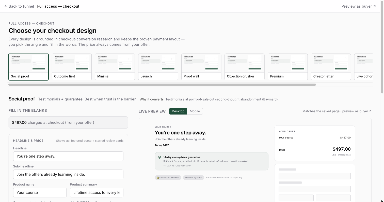
Click the checkout card on the funnel canvas (or Open the design studio → from the Design tab of Checkout settings). The Choose your checkout design screen opens with a strip of live miniatures, each one showing your real offer, price and copy, not a stock screenshot.
Pick a design
Ten designs, each grounded in checkout-conversion research (the card tells you why it converts):
- Social proof: testimonials + guarantee. Best when trust is the barrier.
- Outcome first: what they walk away with, right beside the pay button.
- Minimal: low-ticket, no fuss. Nothing to read, just pay.
- Launch: a value stack, then the price, with an honest urgency line.
- Proof wall: a wall of student results for cold traffic.
- Objection crusher: answers the last doubts right next to the form.
- Premium: restrained, high-ticket taste. No hype.
- Creator letter: a personal signed note; trust does the closing.
- Live cohort: a class with a real start date and live sessions.
- Video (VSL): your sales video carries the pitch.
Hover a miniature for a readable zoom; click to select. Switching designs keeps your copy. The same slots feed every template.
Fill in the blanks
The Fill in the blanks form shows only the slots your selected design uses, each group labelled with where it appears on the page. The core slots:
- Headline and Sub-headline: the pitch at the top.
- Product name and Product summary: what the order summary calls the thing.
- Benefit bullets: the checklist or value stack of what they get.
- Testimonials: quote, name, role and photo (more below).
- Money-back guarantee: headline and body for the guarantee card.
- Last questions (FAQ): the final objections, answered at the form.
- A compare-at price: shown struck through, display-only, and only when it is higher than the price your offer actually charges.
Some designs add a signature slot of their own: Launch has an urgency line that only shows if you write one (Knola never fakes deadlines); Creator letter has your 2–3 paragraph signed note; Live cohort takes your real start date and session details; Video (VSL) takes a YouTube, Vimeo or Loom link.
Only ever use real testimonials
The testimonial slots exist for your actual students’ words: quotes you have permission to use, with real names and roles. For the photo, use the student’s real photo or leave the initials avatar; stock or AI faces read as fake and convert worse than none at all.
The same honesty rule powers Show verified student count: it displays the live enrolment number from your real course data once you pass 25 students. The number cannot be typed, so it cannot lie.
Let AI write the copy from your course
When the offer is connected to a course, Knola drafts the fillable blanks from the course content automatically on your first visit, and a Write this from {your course} link (later Rewrite from {your course}) reruns it for the design you are looking at. The AI writes headlines, summaries, bullets and FAQ. It never touches testimonials, your video link, the compare-at price or the urgency line.
Preview live and save
The Live preview pane updates as you type, showing the exact page buyers get (order summary, bump and payment form included), with a desktop/mobile toggle. While you have edits pending it says Showing unsaved edits. Save to put them live; click Save & publish in the sticky bar to update the page, and Preview as buyer ↗ to open the saved version in a new tab.
Advanced: convert to a custom page (one-way)
If you truly need free-form control, the link at the bottom, Advanced: customize this checkout in the page builder (one-way), converts the checkout into a regular page-builder page. It is a one-way door: the design chooser is disabled for that step afterwards. Most creators never need it; the templates already protect everything that makes a checkout convert.
Which checkout template converts best?
It depends on your traffic. Warm audiences respond to Creator letter and Social proof; cold traffic needs the proof density of Proof wall or Objection crusher; low-ticket offers do best with Minimal. Each card in the studio explains the research behind the design.
Can I change the checkout template after publishing?
Yes. Your slot copy is shared across designs, so switching templates keeps everything you wrote. Save and the live page updates. The only exception is a checkout converted to a custom page, which leaves the templates for good.
Does the AI write my testimonials too?
No, deliberately. AI fills headlines, summaries, bullets and FAQ from your course content, but testimonials, your video link, the compare-at price and the urgency line are yours alone. Proof and scarcity must be real.